Myrelis: redesigning the “My flyer” feature
Rethinking a flyer editor to cut its complexity and let users get there on their own.
- Role
- Product Designer
- Client
- Myrelis
- Duration
- 5 days
- Type
- B2B SaaS
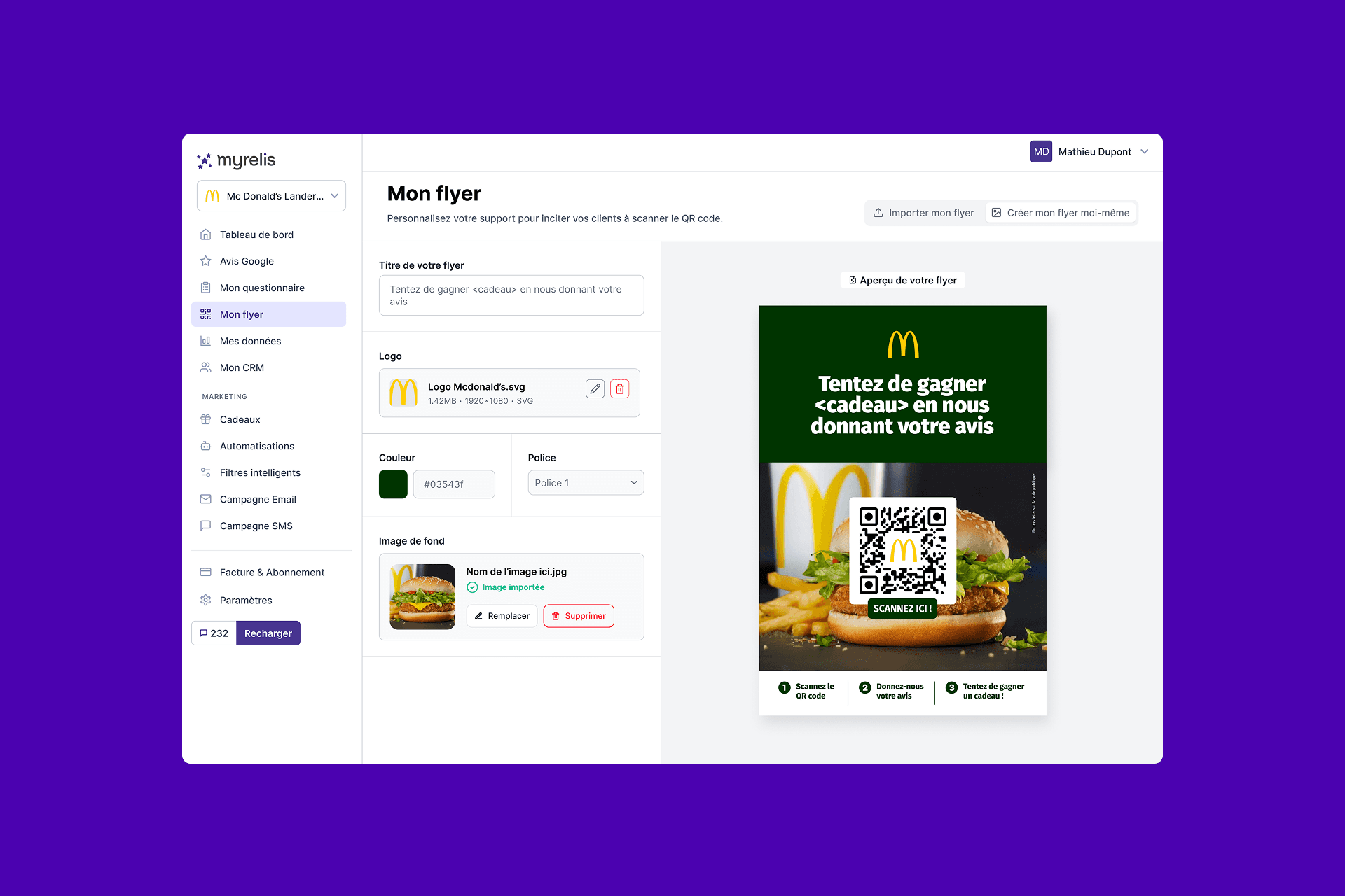
Myrelis is a SaaS product built by the agency Lumy that helps shops, franchises and retail networks collect more Google reviews through printed material carrying a QR code. The product was already live, but the feature for creating that material was barely used.
It was too complex, and regularly needed the team to step in and help - a significant time cost for the client. My brief was to rethink the feature entirely: simpler, more visible, and something users could handle alone.
Understanding the problem
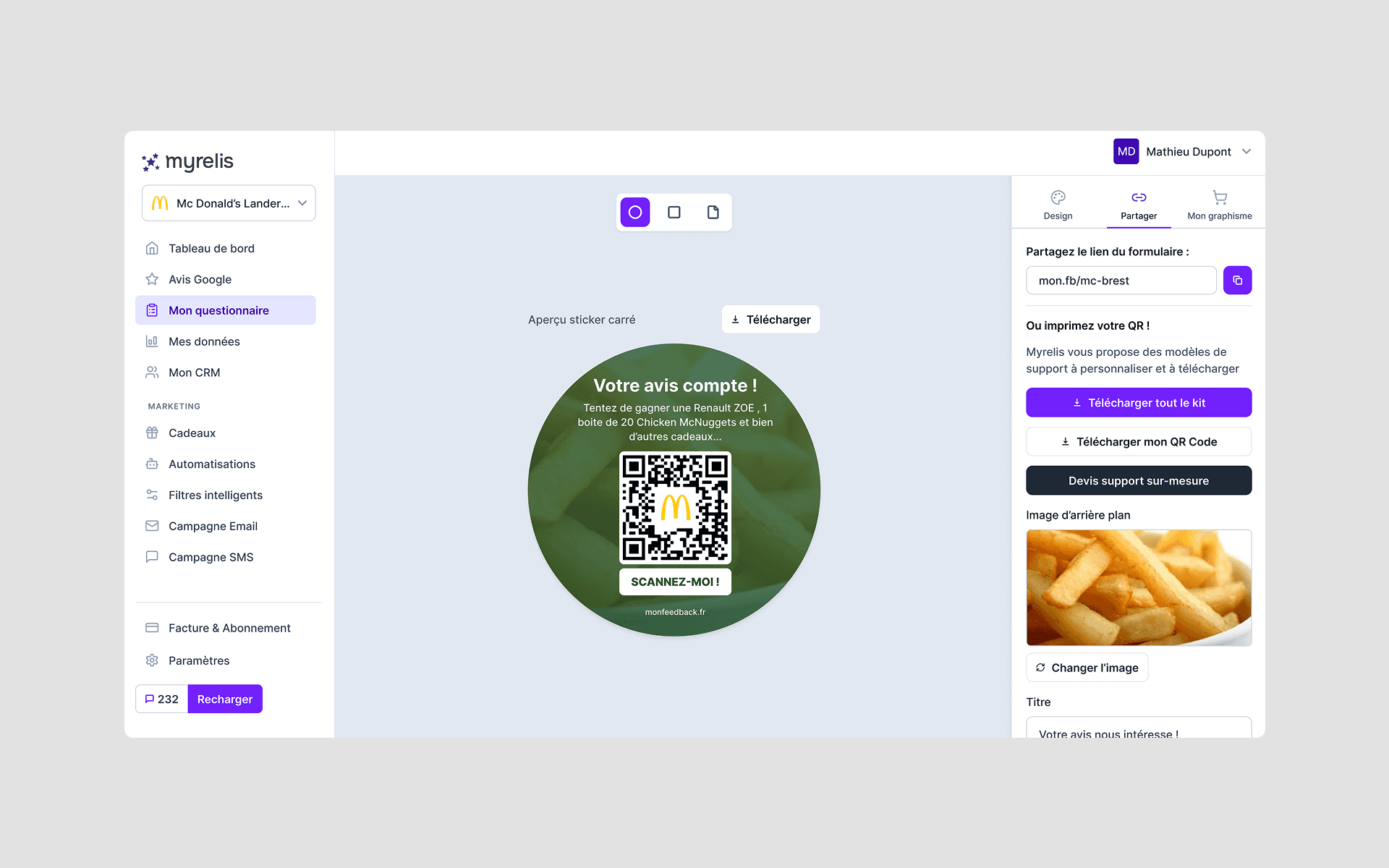
The feature, then called “My design”, had no existence of its own. It was bolted onto the end of editing the satisfaction survey: to create a flyer, users first had to edit their survey, then carry on through the same flow.
The editor offered a great deal: several formats, stickers, square supports, an assortment of graphic settings. All that flexibility answered very few real needs while making the experience hard to pick up.
Myrelis users, though, are mostly business owners and managers. They rarely have design skills and have little time to spend on a flyer. Their goal is not to design something original - it is to get a clear, printable, effective piece of material, fast.
That tension between freedom to customise and ease of use drove the whole redesign.
Separating two journeys for two different jobs
The first task was to pull apart two flows that were chasing different goals.
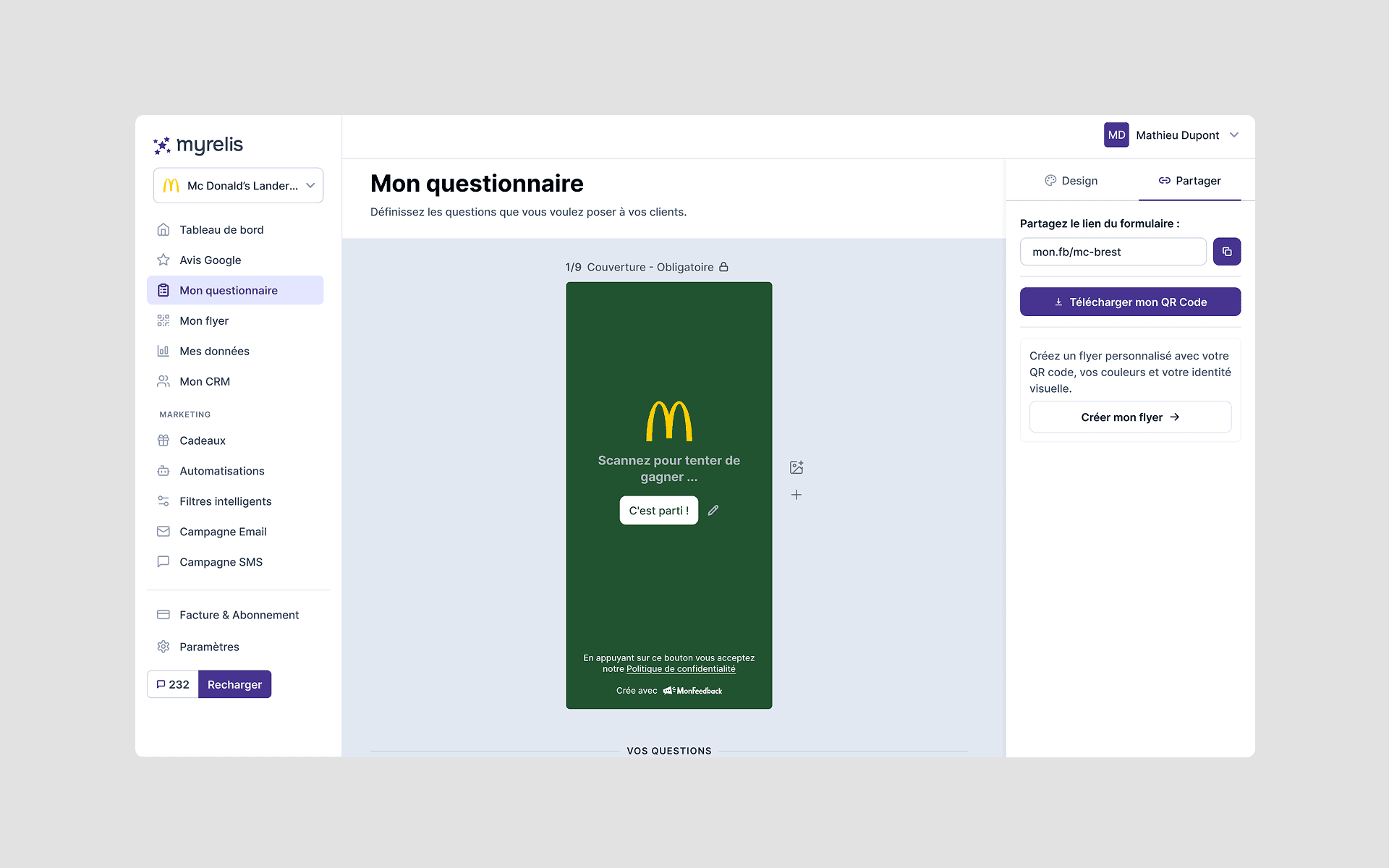
I lifted flyer creation out of the “My survey” journey and made it a feature in its own right, reachable straight from the main menu. This new section gathers every action related to printed material: design, preview, download and print.
I also added a fork at the end of the survey creation flow.
Users can now:
- download the QR code alone, to hand to their own designer;
- or create their flyer directly inside Myrelis.
Everyone lands on the path that matches their need, without passing through a flyer editor they never wanted.
Simplifying by removing choices
The second trade-off was how much customisation to allow.
Rather than add options, I went through every possibility the old editor offered and asked whether it genuinely added value or simply added complexity.
Together with the client, we dropped stickers and the other niche formats, keeping only A4 and A5 - the most used and the best suited to what businesses actually need.
The decision simplifies the experience while still covering the vast majority of cases.
I also restructured the flyer around three clearly readable zones:
- a header with the logo and a customisable line of text;
- a central block holding the QR code and an image;
- a footer carrying three reassurance points with icons.
The rest of the interface is deliberately constrained:
- a single typeface;
- a small library of backgrounds;
- fixed icons;
- settings that had become pointless, removed.
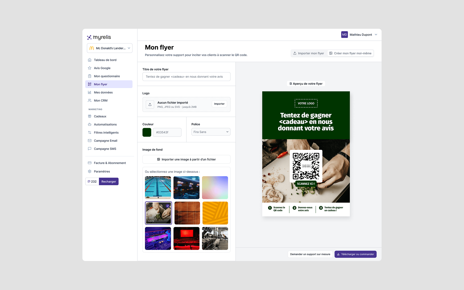
The aim was not to limit creativity, but to frame customisation tightly enough that the printed result stays legible and coherent.
It also protects accessibility, keeping contrast, visual hierarchy and text sizes under control whatever choices the user makes.
By refocusing the editor on everyday needs, Myrelis cuts the number of requests handled by hand and frees up the team's time. Advanced customisation can then become a paid, dedicated service.
Designing straight in high fidelity
The product already had Figma files and a complete UI kit. I built on them to design the new flows directly in high fidelity, with no wireframing stage. It made conversations with the client easier and got developer-ready screens out faster.
I also used AI as an exploration tool, to compare several directions and find the simplest, most fitting solution.
As the only Product Designer on the project, I owned every design decision, in close collaboration with the client. Choices and trade-offs were made gradually, through our conversations and directly in Figma, rather than at a final review.
Anticipating what users' choices would break
I chose to let users set the flyer's colours themselves. But they are not designers, and have no particular reason to know the contrast rules that keep a printed piece readable. A colour that was too light or too dark could make the information illegible.
So the problem became: guarantee contrast without asking users to master a technical standard.
I proposed building a warning directly into the editor, triggered when contrast drops too low. Rather than expose a ratio or cite a standard, the message flags the problem the moment it appears and lets the user adjust the colour before finishing their flyer.
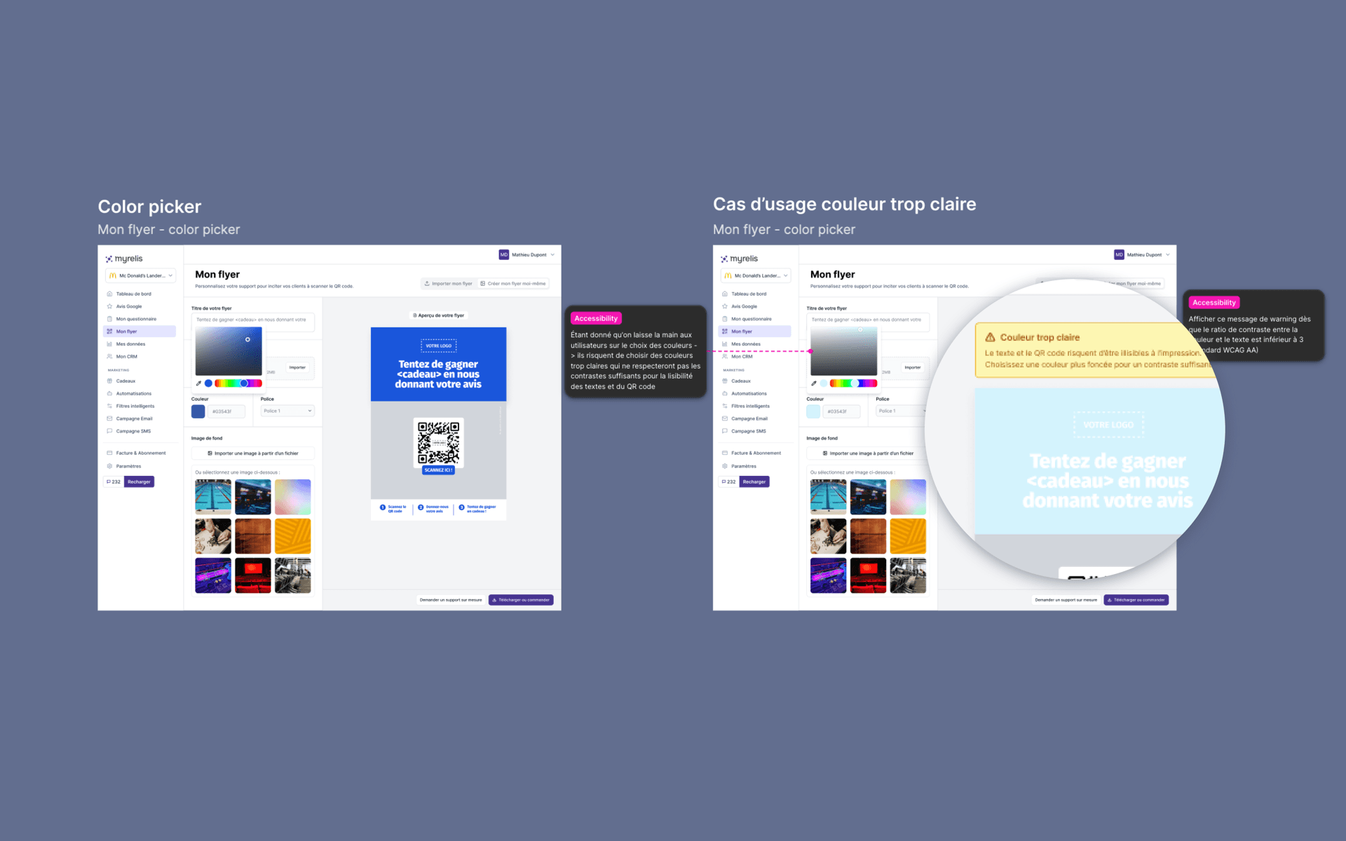
The approach keeps the freedom to customise while shifting part of the accessibility and technical burden onto the product itself.
Results
Client feedback confirmed that simplifying the flyer editor addressed the difficulties users had been hitting, and cut the amount of hand-holding required.
The feature shipped to production. The flyer now comes pre-filled from information already entered elsewhere in the product, guiding the user as far as possible through building it.
What I took away
This project reinforced something essential: giving users fewer choices can improve the experience, when the quality of the outcome matters more than personalisation.
Here, simplifying did not mean stripping out features - it meant removing the ones that created complexity without earning their keep.
With more time and budget, I would have liked to put those trade-offs in front of real users, to explore different levels of customisation before locking some of the design decisions down.