CEDRE: a full website redesign
A full website redesign, restructuring the information and the journeys into an experience that is clearer, smoother and more accessible.
- Role
- UX/UI Designer & Product Owner
- Client
- CEDRE
- Duration
- 10 days
- Type
- Institutional site, FR/EN
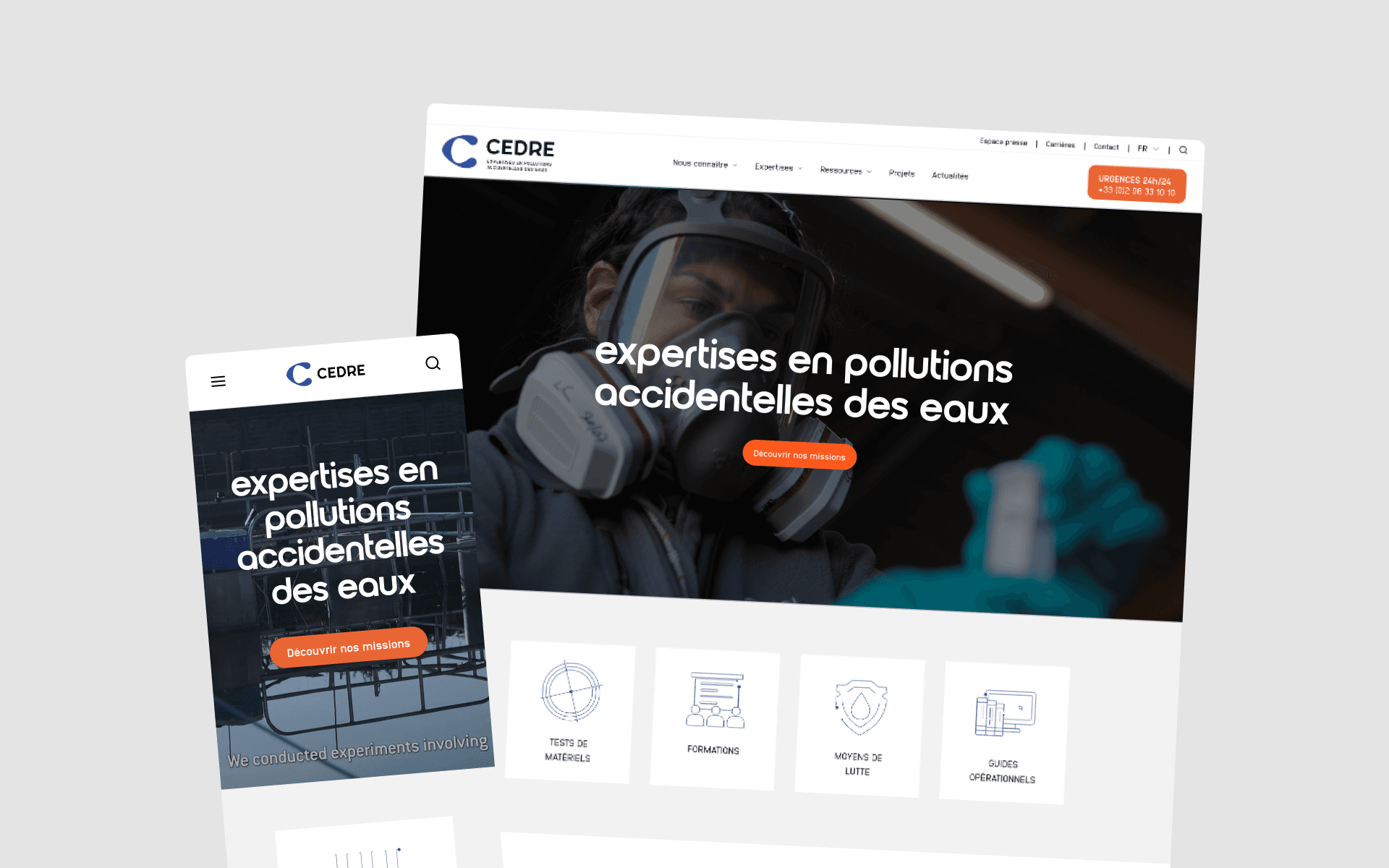
Founded after the Amoco Cadiz oil spill of 1978, CEDRE is an international centre of expertise on accidental water pollution.
For more than forty years it has supported French and international authorities in preparing for and managing environmental crises, alongside its research, training and documentation work.
The redesign had two goals: modernise a website that had become technically obsolete, and make its experience clearer, more coherent and more durable.
The challenge
The main issue was not a visual one.
The legacy CMS was no longer maintained, which put the site's security at risk - and its ability to stay up under a sudden surge of traffic. In a major pollution event, that site is one of the main ways people reach CEDRE's information.
On top of that technical constraint sat several design challenges:
- clarify an offering that had grown far richer since the previous version of the site;
- make technical content reachable for users who do not speak the scientific vocabulary;
- bring in new areas of expertise the site had never covered, such as aquatic waste or new propulsion fuels;
- keep a set of well-established services running: search, e-learning, forms, specialist databases, bilingual content and analytics.
The task was to design an experience that could absorb CEDRE's evolution without making the navigation heavier.
My role
I saw the project through from interface design to the site going live.
The first wireframes had been produced during the UX phase. My work was to challenge them, then design the high-fidelity mockups, adapt the new visual identity to the web, and iterate on client feedback.
I also followed development, ran the QA phases and made the adjustments needed up to delivery.
Working directly with CEDRE's information and communication team, we evolved the interfaces gradually, reconciling business needs, technical constraints and user feedback.
Designing for very different audiences
One of the redesign's central challenges was the sheer variety of its users.
CEDRE serves local authorities, government bodies, industry, researchers and journalists, as well as job applicants and the general public. Many are close to the field but without deep scientific training. Contacts inside government bodies change roles regularly, and sometimes discover CEDRE at the exact moment they need a specific piece of information.
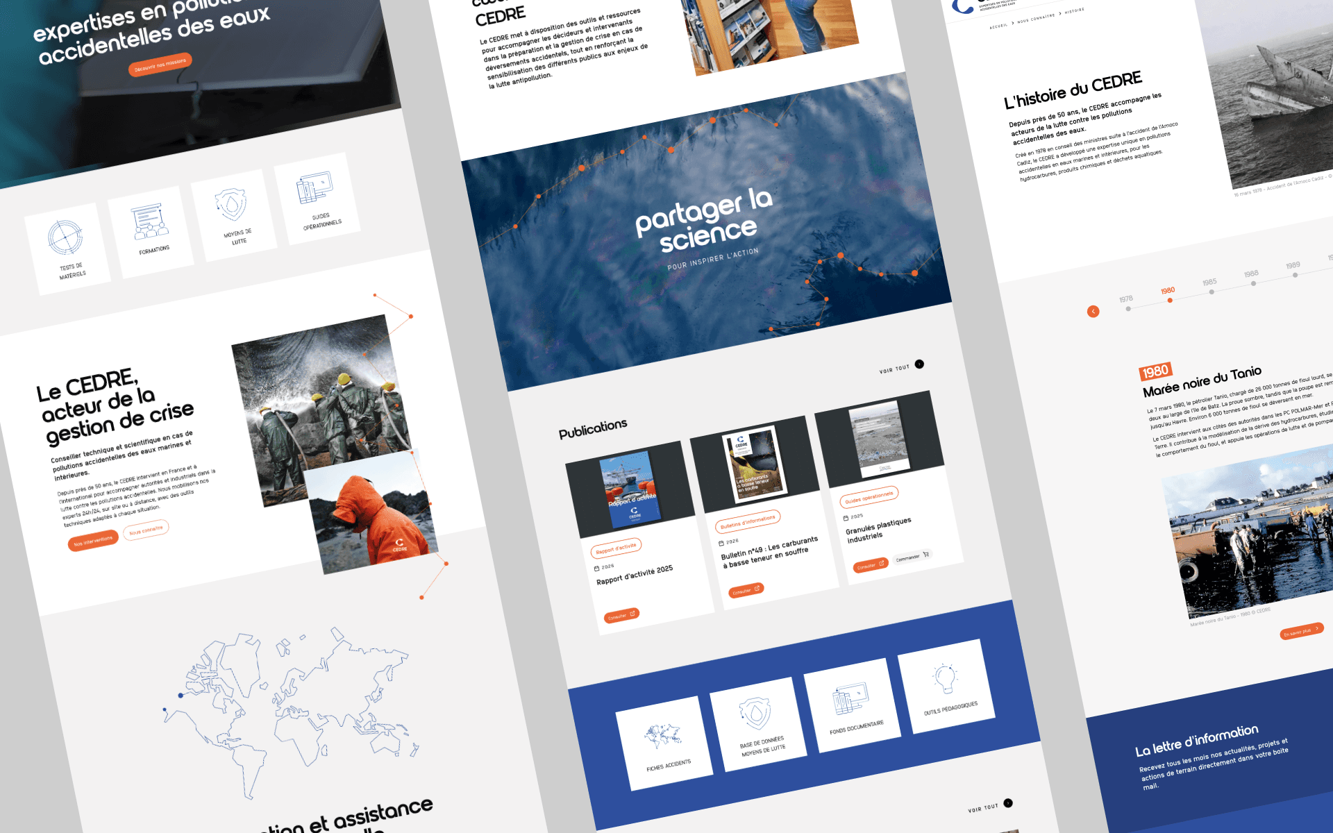
That variety of uses drove several design decisions:
- simplify the navigation labels;
- make the journeys more explicit;
- sharpen the information hierarchy;
- design an experience that is coherent and accessible on desktop and mobile alike.
The goal was for every user to find the door that matched their need quickly, without having to understand how CEDRE is organised internally.
That variety of profiles comes with a variety of contexts, too: a researcher reads the documentation at their desk, while an operative deployed on a spill or a journalist on the move look for the same information on their phone.
So I designed the redesign around mobile constraints from the outset: navigation, tables, records and filters all stay clear and fully usable at any screen size.
Translating a print identity for the web
Alongside the web redesign, CEDRE was renewing its visual identity with a communications agency. That identity had been designed above all for printed material.
My role was to translate it into a coherent digital experience.
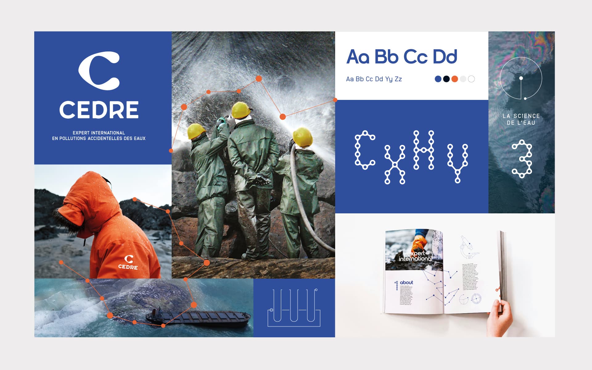
From the graphic codes the agency had set, I built the project's web identity as an interface system fit for digital use: responsive grids, components, typographic hierarchy, button styles, forms, cards, navigation and page templates.
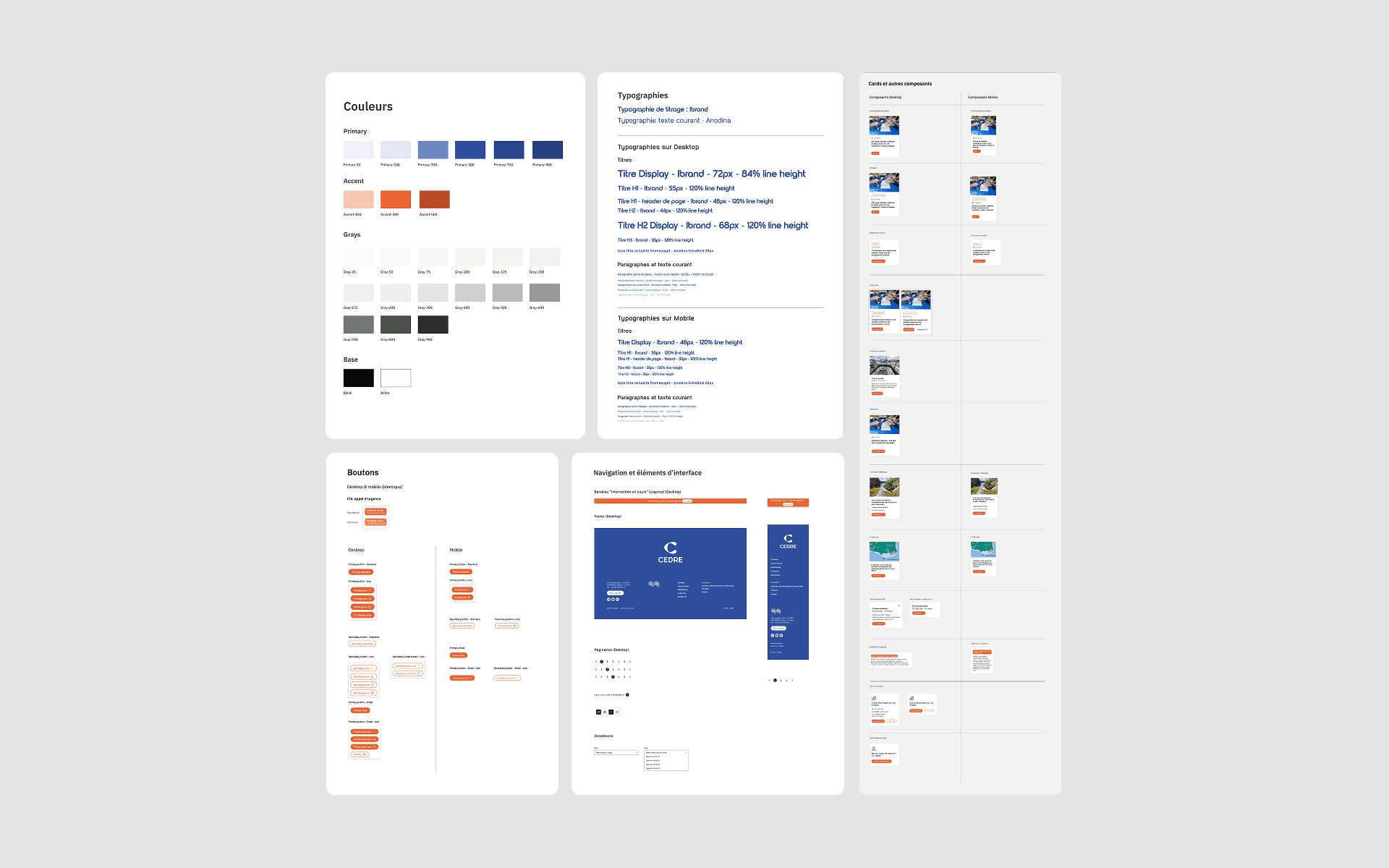
The aim was not to reproduce the brand guidelines, but to build an interface language that could honour the brand while answering the web's demands: legibility, responsiveness, coherence across pages, and room to grow.
That work laid the site's visual foundations and held the whole thing together, whatever the feature or the type of content.
Making complex data easier to explore
Two areas took most of the interaction design work: the “Response equipment” database and the interactive map of pollution incidents. Both hold data that is genuinely valuable to people in the field, but was hard to move through in its original form. The task: make exploration flow without thinning the content or crowding the interface.
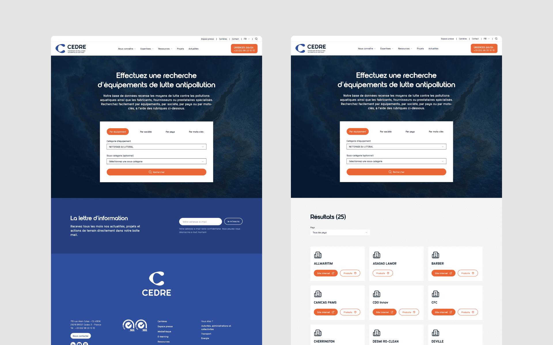
The “Response equipment” database catalogues the specialist equipment used against accidental pollution. The goal was to let users find suitable equipment quickly - sometimes under real pressure. I worked on the legibility of the results, how each record is organised, and the movement between searching and reading, so that comparing options never means losing your place.
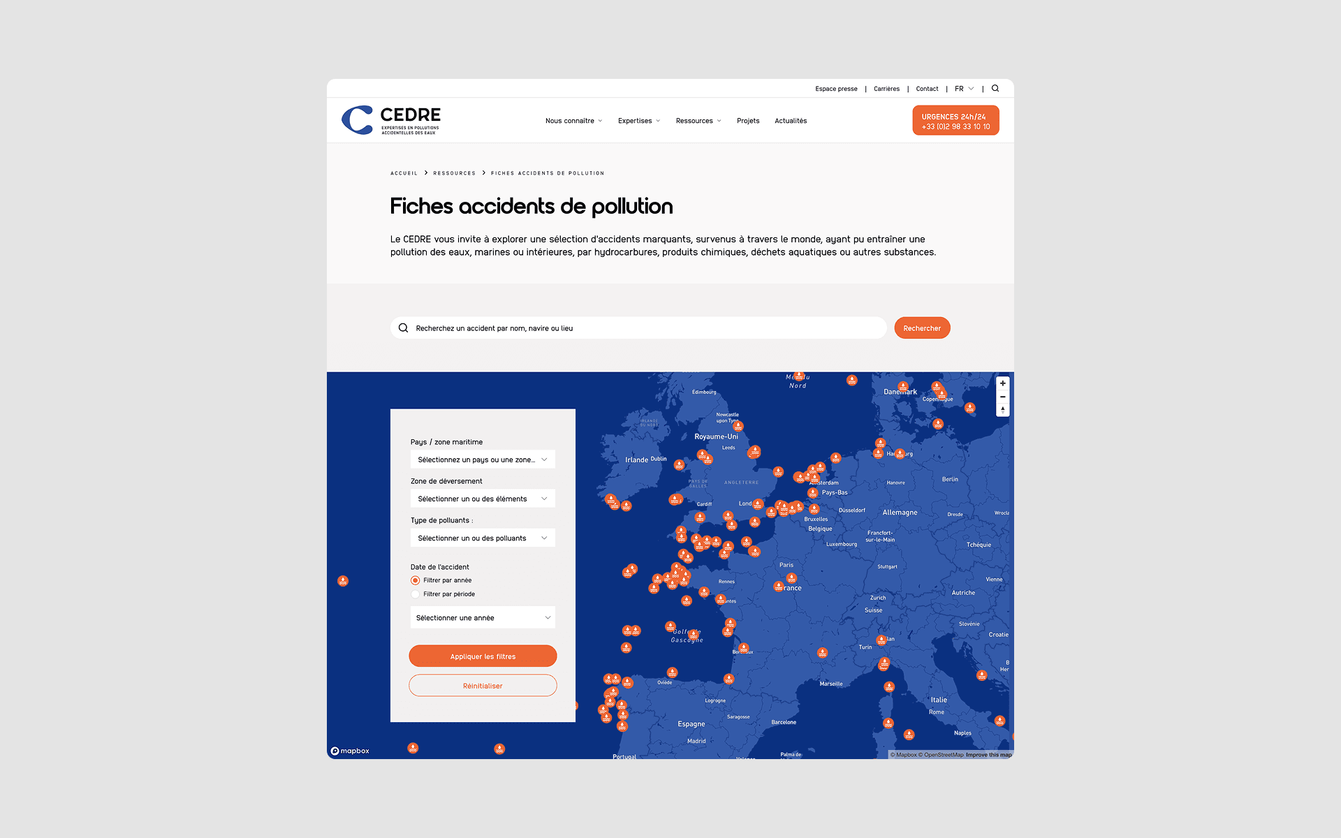
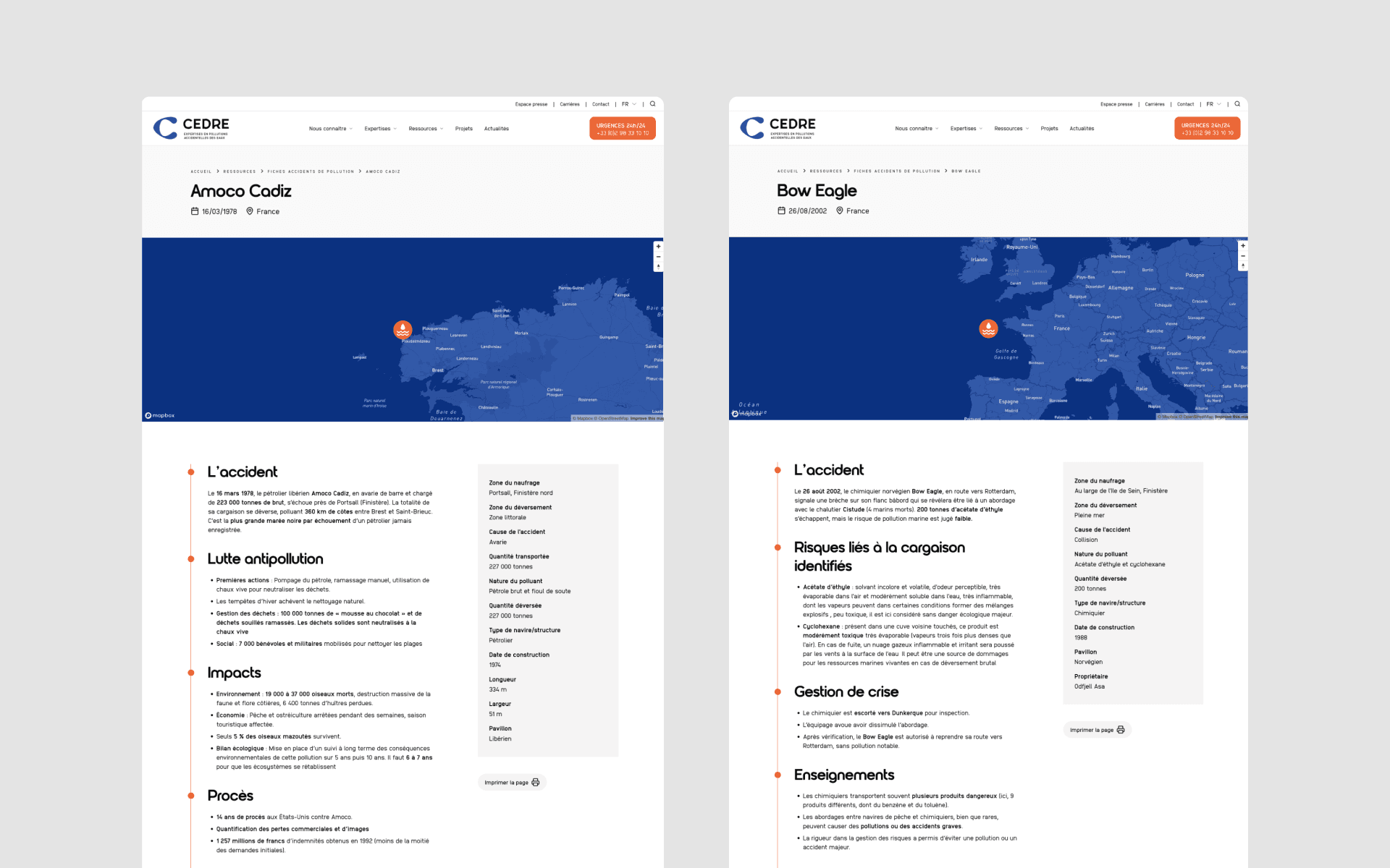
The interactive map posed a different problem: holding a geographic overview and the detail of each incident together, without cluttering the map. I reworked the information hierarchy and the interactions between map and records, so that moving from one to the other feels natural.
What I took away
The redesigned site is live at cedre.fr.
This project reminded me that a redesign is not only about modernising an interface. Designing for CEDRE meant making technical expertise more reachable without diluting it, while imagining an experience able to grow with the organisation's remit.
The most demanding screens turned out not to be the most spectacular ones: they were the data-browsing interfaces, where perceived quality owes less to aesthetics than to structure - what you show first, in what order, and what you keep one click away.
It also taught me to work within a demanding institutional setting. The constraints were many and decisions were taken collectively, across several levels of approval: every trade-off took time. Rather than absorb those delays, I learned to document my decisions and prepare the decision points in advance, so that conversations could be about substance rather than about deciphering the mockups.
And it let me strengthen a practice I particularly value: carrying a project through to something real, holding the line between what the client expects, what development allows, and what the experience demands.